US Cities and Changes in COVID-19 Racial Disparities Throughout the Pandemic
November 2, 2021
The COVID-19 Health Inequities in Cities dashboard was created to compare and track inequities related to the COVID-19 pandemic on a multitude of dimensions, exploring subgroups within cities, neighborhoods within cities, and across cities. The newest addition to the dashboard focuses on describing and comparing inequities by race/ethnicity in COVID-19 outcomes over the course of the pandemic.
From the dashboard homepage users can click on City Report/Inequities/Outcomes to select a city of interest and examine trends in COVID-19 outcomes over time for different racial and ethnic populations. Users can select whether to visualize case incidence, mortality, or hospitalization as their outcome of interest and can filter by crude or age-adjusted rates. The trends are presented by quarters of the year, each being an aggregate of three months: quarter 1 (Q1) is January-March, quarter 2 (Q2) is April-June, quarter 3 (Q3) is July-September, and quarter 4 (Q4) is October-December.

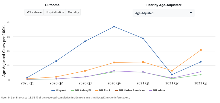
Figure 1. COVID-19 incidence over time by race/ethnicity in San Francisco, CA
Figure 1 shows the change in age-adjusted COVID-19 cases per 100,000 from quarter 1, 2020 to quarter 3, 2021 in San Francisco stratified by race/ethnicity. Hispanic individuals in San Francisco saw the highest incidence rates of COVID-19 among the five race/ethnicity groups from the early pandemic until quarter 2, 2021 when incidence rates among non-Hispanic (NH) Black individuals became the highest.
Hovering over each data point in the figure will expand a detail box that provides the exact count of cases per 100,000, the rate ratio as compared to NH Whites, and an explanation of the disparities between race/ethnicity groups. For example, in San Francisco during quarter 4 2020, the incidence rate of COVID-19 cases for Hispanics was six times higher than the rate for NH Whites.
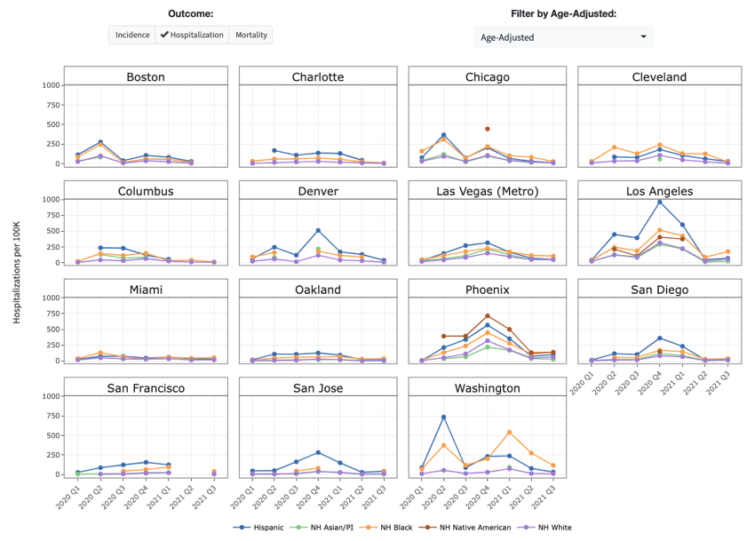
Another new feature on the dashboard allows users to view trends in COVID-19 outcomes by race/ethnicity for multiple cities simultaneously. This feature can be found on the homepage by visiting Compare Across Cities/Outcomes/Individual Level. Users can compare crude or age-adjusted rates over time for one of three outcomes: incidence, hospitalization, and mortality. Figure 2 shows age-adjusted hospitalization rates over time among different race/ethnicity groups for 15 cities.

Figure 2. COVID-19 Hospitalization rates by race/ethnicity over time in various US cities
Using Figure 2, users can efficiently compare how different stages of the pandemic impacted various race/ethnicity groups across different cities. For example, during quarter 4 2020, Los Angeles saw much higher hospitalization rates among NH Black individuals compared to other racial/ethnic groups whereas Phoenix saw the greatest hospitalization rates among NH Native American individuals during the same period. Again, users can hover over any individual data point to obtain details on the exact rate, rate ratios compared to NH whites, and explanations of the differences.
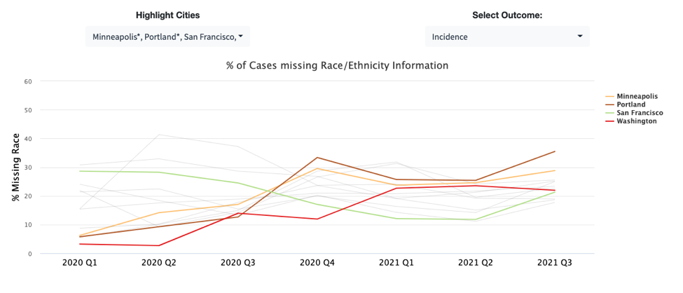
The final update, also found in the Compare Across Cities/Inequities: Outcomes/Individual Level section, includes a visualization displaying the percentage of data missing race/ethnicity information from each city and the change over time. Figure 3 shows how four highlighted cities (Minneapolis, Portland, San Francisco, and Washington) have varying percentages of missing race/ethnicity information within the incidence data reported to the CDC over time. While only cities that met certain thresholds for the level of increasing amounts of missing data from the population, also known as missingness, are included in the analysis, we can see in Figure 3 that the percent of cases missing race/ethnicity data ranges from 3% in Washington quarter 2 2020, all the way to 35% in Portland quarter 3 2021. For many cities, the percentage of missingness in race/ethnicity data trends upward over time. A decrease in the data quality due to missingness makes it more difficult to fully understand and address health inequities.

Figure 3. Percent of reported cases missing race/ethnicity information over time in select US cities
The nature of the COVID-19 pandemic has brought constant changes and additional challenges through several waves of infections, novel variants, and changing policies. Innovative preventative measures, like vaccines, have also change the landscape of this pandemic. This dashboard is an important tool to help evaluate how inequities related to race/ethnicity may have changed over time in the context of all these developments. Understanding a broader picture of the disproportionate impacts of this pandemic on different populations is vital to ensure that health equity is at the forefront of the response to the next health crisis.
The dashboard will continue to provide the most up to date COVID-19 data. Explore the dashboard to better understand the COVID-19 pandemic from an urban health perspective. This project is conducted in collaboration with the Big Cities Health Coalition and is funded by the Robert Wood Johnson Foundation.