Inequities in COVID-19 Vaccination and Vaccine-Related Outcomes
August 4, 2021
Earlier this year researchers from Drexel’s Urban Health Collaborative launched the COVID-19 Health Inequities in Cities dashboard. As of last month, the dashboard has undergone several updates including new blog posts, a public access data repository, and a new section focused on COVID-19 vaccination inequities. This new section leverages vaccination data from 29 large US cities, allowing users to characterize, track, and compare COVID-19 vaccination inequities on multiple levels: across individuals within cities, across neighborhoods within cities, and across cities.
Vaccine Inequities Within Cities
To examine inequities in COVID-19 vaccination for a particular city, dashboard users can access the City Report: Vaccination Inequities tab, which provides city-specific vaccine inequity data by race/ethnicity (Figure 1), and key neighborhood characteristics (Figure 2).
Figure 1
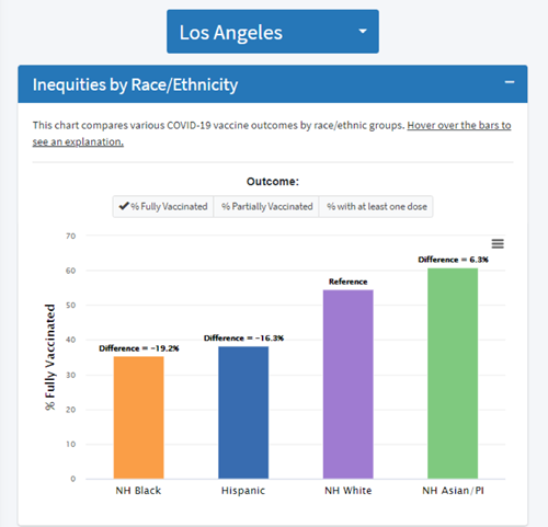
Figure 1 compares the percentage of individuals fully vaccinated by race/ethnicity for Los Angeles, CA. This figures shows that the percentage of fully vaccinated Hispanic individuals is 16.3% lower compared to Non-Hispanic (NH) Whites. There is a similar trend for NH Blacks, where the percentage of fully vaccinated individuals is 19.2% lower than NH Whites.
Figure 2
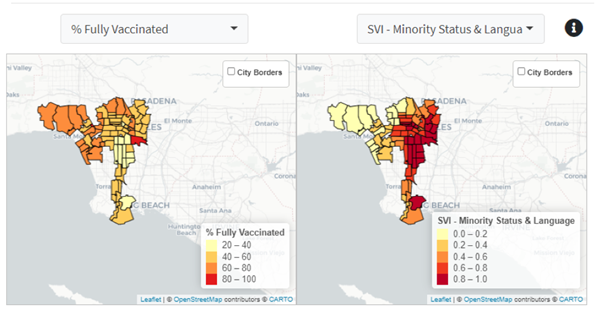
Figure 2 examines the percentage of fully vaccinated individuals by minority status and language social vulnerability index (SVI) for Los Angeles neighborhoods. This map indicates that Los Angeles neighborhoods with higher percentages of non-White individuals that speak English “less than well” experience relatively low percentages of fully vaccinated individuals. This is especially true for neighborhoods in central and northeast Los Angeles.
Vaccine Inequities Across Cities
The Compare Across Cities: Vaccination Inequities tab allows users to describe and compare COVID-19 vaccination rates and other COVID-19 vaccine-related outcomes across different population subgroups, neighborhoods, and cities. At the individual level, users can visualize vaccination inequities and vaccine coverage (Figure 3) by race/ethnicity across several different cities.
Figure 3
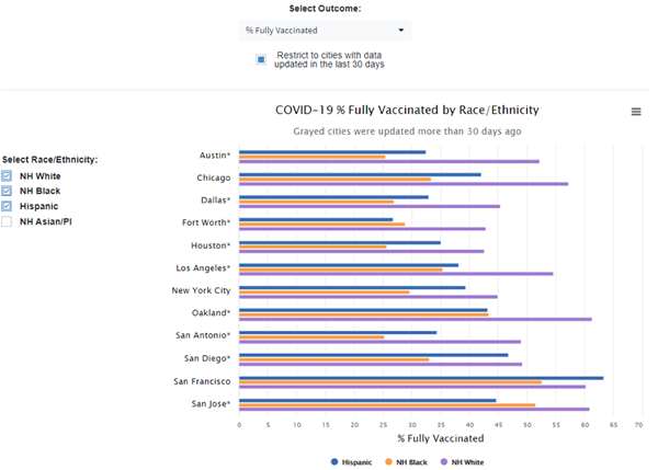
Figure 3 shows rates of COVID-19 Vaccination coverage by each race/ethnicity separately across all available cities. These results suggest that in all but one city (San Francisco, CA), Hispanics have lower percentages of fully vaccinated individuals than NH Whites. Similar to inequities in vaccine coverage for Hispanics, we see that NH Blacks have lower rates of full vaccination than NH Whites in all cities for which data is available.
The neighborhood-level visualizations are similar to those at the individual level, except the dashboard can visualize and describe inequities in COVID-19 vaccination (Figure 4) and vaccine coverage by select neighborhood factors like demographics, education, income, occupation, transportation, housing, health insurance coverage, segregation and vulnerability.
Figure 4
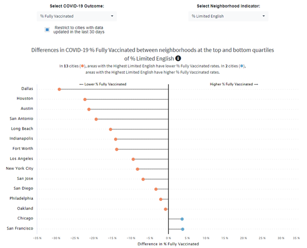
Figure 4 explores differences in the percentage of fully vaccinated populations between neighborhoods at the top and bottom quartiles (25%) of households that have limited English speaking. Figure 4 shows that in 13 cities, neighborhoods with higher percentages of limited English speaking have lower percentages of fully vaccinated individuals, and in 2 cities (Chicago, IL & San Francisco, CA) neighborhoods with higher percentages of limited English speaking have higher percentages of fully vaccinated individuals.
Aside from exploring vaccine inequities at the individual and neighborhood levels, users can describe inequities in COVID-19 vaccination rates by designated city-level factors (Figure 5) such as demographics, income, occupation, housing, segregation, and vulnerability.
Figure 5
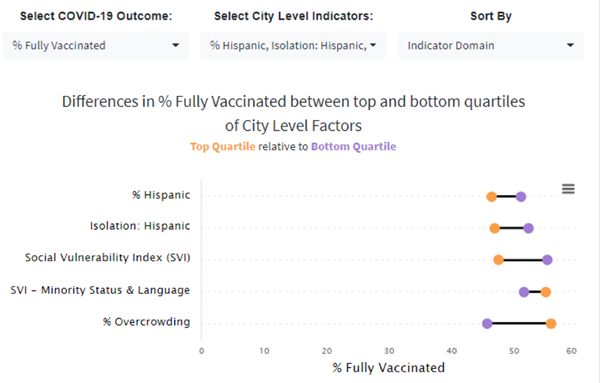
Figure 5 shows the differences in COVID-19 vaccination outcomes between the top and bottom quartiles of select city-level factors: % Hispanic, % Poverty, Isolation Index for Hispanics, SVI, SVI for Minority Status and Language, and % Overcrowding. Results displayed in Figure 5 indicate that the percentage of fully vaccinated individuals is 5.46% lower in cities with the highest Hispanic segregation compared to cities with the lowest Hispanic segregation.
The dashboard will continue to provide the most up to date COVID-19 data. Explore the dashboard to better understand the COVID-19 pandemic from an urban health perspective.