Overview
The COVID-19 pandemic has exposed deeply entrenched inequities in cities across the United States. These inequities are the result of long-standing racial, economic, and social inequalities that existed prior to the pandemic. Over the course of the pandemic these inequities have manifested themselves as inequities in access to testing, in incidence, in hospitalization and in mortality related to COVID-19. In this dashboard we provide descriptive data of how COVID-19 related outcomes, and especially inequities in these outcomes, are evolving in the cities that are part of the Big Cities Health Coalition. We use available data to characterize, compare, and track inequities along three dimensions (1) across people within cities; (2) across neighborhoods within cities, and (3) across cities. Click the links for more details on our conceptual framework, indicators we use to measure inequities, and the metrics we use. We hope that these data may be useful to the cities as they continue to develop strategies to protect population health and promote health equity.
Dashboard Features
Feature #1: City Reports
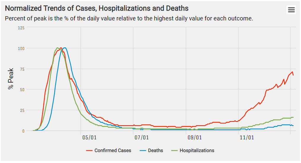
This figure tracks trends in COVID-19 outcomes and presents various outcomes as percent of peak (% of the daily value relative to highest daily value for each outcome). Here we see that daily trends in deaths lag behind daily new cases by about two weeks.

Test positivity ratio (percentage of total COVID-19 tests that are positive) is a key COVID-19 indicator which captures whether levels of testing are keeping up with levels of transmission. Here we can see that for New York City test positivity ratio (blue line) was highest between March and May but dropped significantly after May.

This panel shows cumulative rates of COVID-19 outcomes by race and ethnicity for the selected city. Here we see that in New York City, Hispanics and non-Hispanic Blacks have higher age-adjusted cumulative incidence rates than non-Hispanic whites.

These maps display the spatial heterogeneity in neighborhood level COVID-19 outcomes (left) and neighborhood characteristics (right). Here we can see that in New York City, mortality and social vulnerability are spatially co-located: more vulnerable neighborhoods tend to have higher COVID-19 mortality.
Feature #2: Trends Across Cities

Users can highlight cities of interest to compare trends in COVID-19 outcomes across cities. In this figure we can see that New York reached its peak daily incidence rate in late March but had a new increase in cases in November. In contrast, San Francisco had a smaller increase in March, a second wave in August, and its most severe peak as of late December.

This figure displays trends in COVID-19 outcomes by city characteristics. Here we aggregate cities based on region and show that earlier in the pandemic (March and June) the Northeast had much higher incidence relative to other regions. Shortly after, cases started rising in the South, especially during the summer and early fall.
Feature #3: Individual-Level Inequities

This panel shows cumulative rates of COVID-19 outcomes by race and ethnicity across cities. Here we see that in almost all cities displayed, non-Hispanic Blacks have a higher cumulative incidence rate than non-Hispanic whites.

We can also display differences in COVID-19 outcomes between race and ethnic groups for each city. By hovering over the dots in each city, users can view a more detailed interpretation of inequities. For example, in Boston the incidence rate for non-Hispanic Black residents is 101% higher than the rate in non-Hispanic white residents.
Feature #4: Neighborhood-Level Inequities
For each city, the user can contrast COVID-19 outcome rates in the most advantaged compared to the least advantaged neighborhoods. The magnitude of these differences can be compared across cities.

This figure compares COVID-19 incidence rates in the most socially vulnerable neighborhoods vs. the least socially vulnerable neighborhoods, across several cities. By hovering over the dots in each city, users can obtain a more detailed interpretation of neighborhood level inequities. For example, in San Diego the incidence rate is 251% higher in the most socially vulnerable neighborhoods compared to the least socially vulnerable neighborhoods. Details of the selected neighborhood characteristic can be found by hovering over the black information bubble (“i”).
Feature #5: City-Level Inequities

This example compares COVID-19 incidence rates in cities located in the top quartile vs. cities located in the bottom quartile of selected city- level characteristics. By hovering over the dots in each city, the user can obtain a more detailed interpretation of city- level inequities. For example, the rate is 15% higher in cities in the highest quartile of poverty compared to cities with the lowest quartile of poverty.