Interactive Dashboard Sheds Light on Characteristics Across Philadelphia City Council Districts
August 4, 2025
We're excited to announce the launch of a new interactive dashboard that allows Philadelphia residents, policymakers, and advocates to directly engage with data that shines a light on health equity, education, and other issues in their communities. The Philadelphia City Council District Health Dashboard offers a view of key health indicators, social determinants, and policy-relevant metrics across the city’s ten council districts.
The tool is designed to provide data to inform decision-making in local communities – providing accessible, actionable insights into the health and well-being of Philadelphia residents. Users can explore a range of indicators—from home ownership and crime statistics to educational attainment and tree canopy coverage—all tailored to each council district.
Initial data reveals differences across districts in both health outcomes and social conditions, underscoring the need for place-based approaches to policy and urban planning:
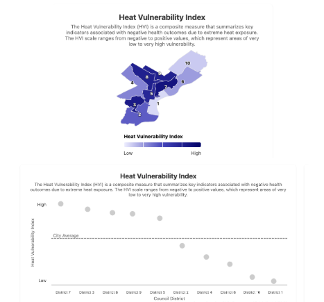
Vulnerability to Heat Waves Varies Significantly Across Districts
By comparison, District 7, which includes neighborhoods like Kensington, Frankford, and Hunting Park, is nearly 200% more vulnerable to heat waves than District 1, which holds neighborhoods like Old City, Society Hill, East Passyunk, and Northern Liberties.
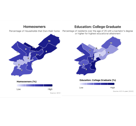
Areas With Some Of The Lowest Rates of College Graduates Have Some Of The Highest Rates of Home Ownership
Districts 7, 6, 9, and 10 all hold some of the lowest rates of residents with a college degree, and are below the city’s average. However, these same Districts hold some of the highest rates of home ownership – well above the city’s average and contrary to the trend exhibited across the country by the US Census Bureau.
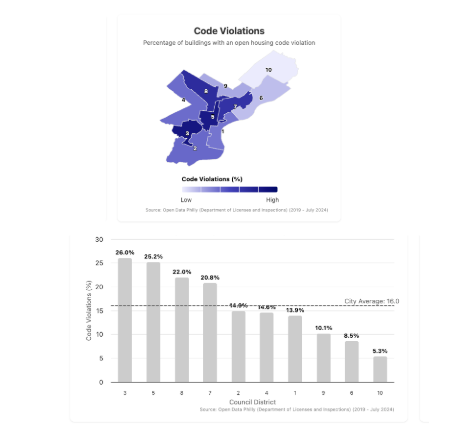
More Than 1 in 4 Of All Buildings in Districts 3 and 5 Have Open Housing Code Violations
These areas, which include West/Southwest Philly and much of Center City respectively, also have the largest number of renters in the city.
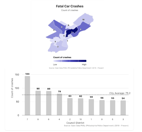
Traffic Fatalities
District 3, home to University City, reports one of the lowest rates of fatal crashes per capita (54), suggesting that existing traffic safety measures and infrastructure may be more effective here compared to other districts.
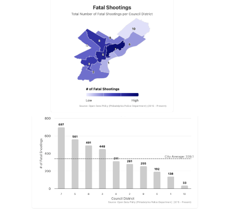
Fatal Shootings
District 7 experienced the highest number of fatal shootings (697), more than twenty times the number in District 10, which had the fewest (33). Districts 5, 8, and 3 also far exceeded the citywide average of 339, highlighting geographic disparities that may reflect broader inequities in economic opportunity and public safety investment.
The dashboard builds the UHC’s commitment to advancing health equity through data transparency and community engagement. It complements other tools developed by the UHC, such as the Big Cities Health Inventory, a similar interactive dashboard that explores large amounts of city data and allows users to compare health outcomes between 35 major cities in the U.S.
Key features of the City Council Dashboard also include:
- District Comparisons: View and compare demographic, health, and environmental data across all ten council districts to better understand spatial inequities.
- Interactive Maps and Charts: Visualize inequities and trends across neighborhoods using clear, easy-to-navigate visual tools.
- Downloadable Data: Export data for use in reports, presentations, and advocacy.
The dashboard is publicly available and will be updated continually as new data becomes available. The UHC encourages community organizations, city officials, and residents to explore the tool and use it to inform conversations about health, equity, and policy in Philadelphia.
Explore The Dashboard
Please reach out to UHC@Drexel.edu with any questions.