New Hospitalization Data Added to the COVID-19 Inequities Dashboard
January 28, 2022
Guest Post Written by: Edwin McCulley, MS
The COVID-19 Health Inequities in Cities Dashboard was recently updated to include new hospitalization data from the US Department of Health & Human Services (HHS). The HHS data is complimented by data from several additional sources, such as state and local health departments, and allows users to examine and compare hospitalization metrics between and across, US cities belonging to the Big Cities Health Coalition (BCHC). Aside from providing measures of disease frequency, this new update allows users to characterize and contrast health inequities related to COVID-19 hospitalization.
While this newsletter article provides a primer to the updated hospitalization data, we recommend that users check out our newest blog post, “Trends and Inequities in Covid-19 Hospitalization Rates by City Level Factors across US Cities” for a more in-depth description of the new features associated with this update.
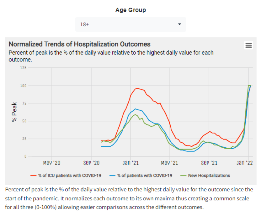
To explore hospitalization metrics within cities, users can navigate to the City Report: Summary section. In this section, users can view hospitalization metrics over time, and across several age groups (i.e., age 0-17, age 18+, & all ages) for a select city. The metrics included the “Weekly Hospitalization Metrics by City” panel include the percentage of hospitalized patients with COVID-19, the percentage of ICU patients with COVID-19, and the number of new hospitalizations.
Figure 1 shows weekly hospitalization trends for adults age 18+ in New York City, NY. As of 01/07/2022, we observe record high numbers for new hospitalizations, the percentage of admitted patients with COVID-19, and the percentage of intensive care unit (ICU) patients with COVID-19.
Figure 1. Weekly Hospitalization Metrics for New York City among Adults (age 18+)
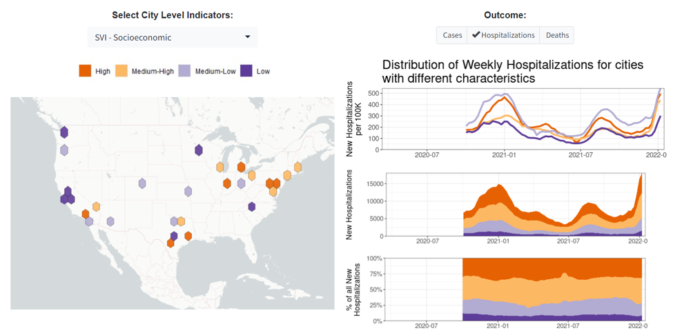
Additionally, users can access several new panels within the Compare Across Cities: City Levels and Trends section of the dashboard. Here, users can compare several hospitalizing metrics (e.g., hospital admissions & hospital occupancy) across 29 large US cities. Users can also examine trends in hospitalization metrics for all BCHC cities, and/or compare hospitalization trends, for different age groups, across a user-defined sample. In the same section, users can view the distribution of hospitalization metrics across BCHC cities by numerous city-level attributes such as those relating to demographics, income, wealth/poverty, occupation, housing, segregation, and vulnerability. Figure 2 shows hospitalization counts and rates across cities by the socioeconomic social vulnerability index (SVI). In this plot, we see greater hospitalization among the most socioeconomically vulnerable cities.
Figure 2. Hospitalization Counts and Rates by SVI – Socioeconomic
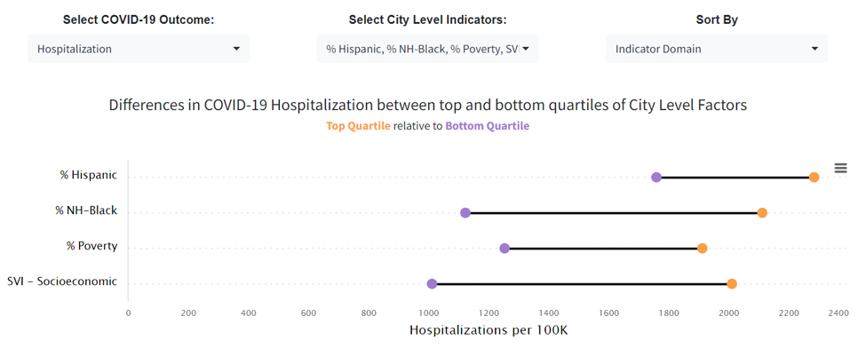
Last, in the Compare Across Cities: Inequities: Outcomes: City Level section of the dashboard, users can access the panel titled “Inequities in COVID-19 Outcomes by City Factors” to investigate inequities in COVID-19 outcomes between the top and bottom quartiles (top 25% and bottom 25%) of city level factors. Figure 3 shows inequities in COVID-19 hospitalization across cities in terms of percent Hispanic, percent non-Hispanic Black, percent living in poverty, and SVI – socioeconomic. Figure 3 shows wide disparities across these city level factors, especially for the SVI – socioeconomic indicator, of which the hospitalization rate is 99% higher (nearly double!) in the most socially vulnerable cities, compared to the least socially vulnerable cities.
Figure 3. Inequities in COVID-19 Hospitalization by City Factors
The recently added data not only offers new ways of measuring COVID-19 hospitalization within and across cities, but it also allows us to examine the magnitude of the ongoing pandemic and its potential impact on healthcare systems in US cities. Understanding the ongoing COVID-19 pandemic requires a data driven, equity-based approach with transparent methodology; all of which are notable strengths of the COVID-19 Health Inequities in Cities Dashboard.